W/01NorfaEditorial Design · Food Photography
View →
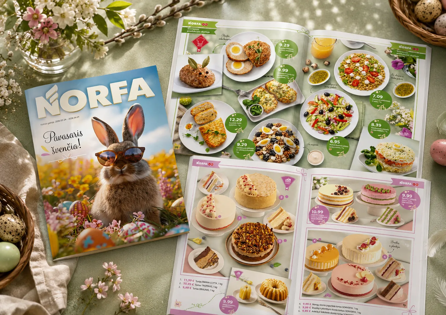
Pavasaris švenčia
A captivating Easter catalogue design featuring a bold, stylish rabbit cover character and a beautiful pastel colour progression from fresh greens to confectionery pinks.

● Vilnius · Creative Studio · Est. 2016
— A note from the studio
W idea is a creative studio in Vilnius. We design retail catalogues and packaging, and shoot the photography that goes inside them.
Discipline
Raw energy,
executed cleanly.
Index
01 Editorial · 02 Photography · 03 Packaging · 04 Branding
§ 01 · Selected Works
18 projects · Retail, FMCG & print
A captivating Easter catalogue design featuring a bold, stylish rabbit cover character and a beautiful pastel colour progression from fresh greens to confectionery pinks.
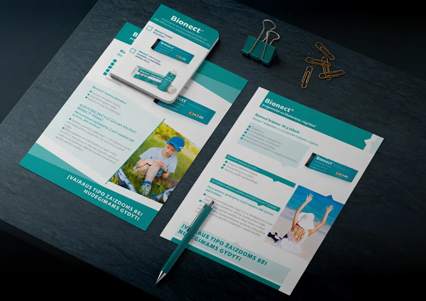
A cohesive set of healthcare materials designed to bring consistency, clarity and accessibility to patient communication. We gave the product its own visual language — one grid, one palette, one voice, holding every piece together.
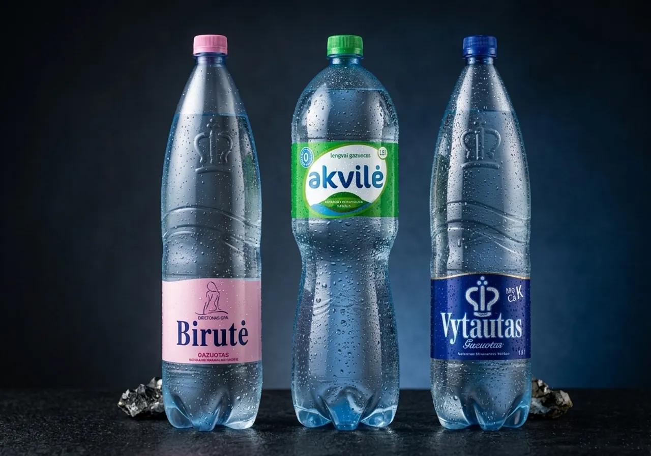
Bottles sprayed and shot in the studio, then retouched drop by drop until they looked cold enough to reach for.
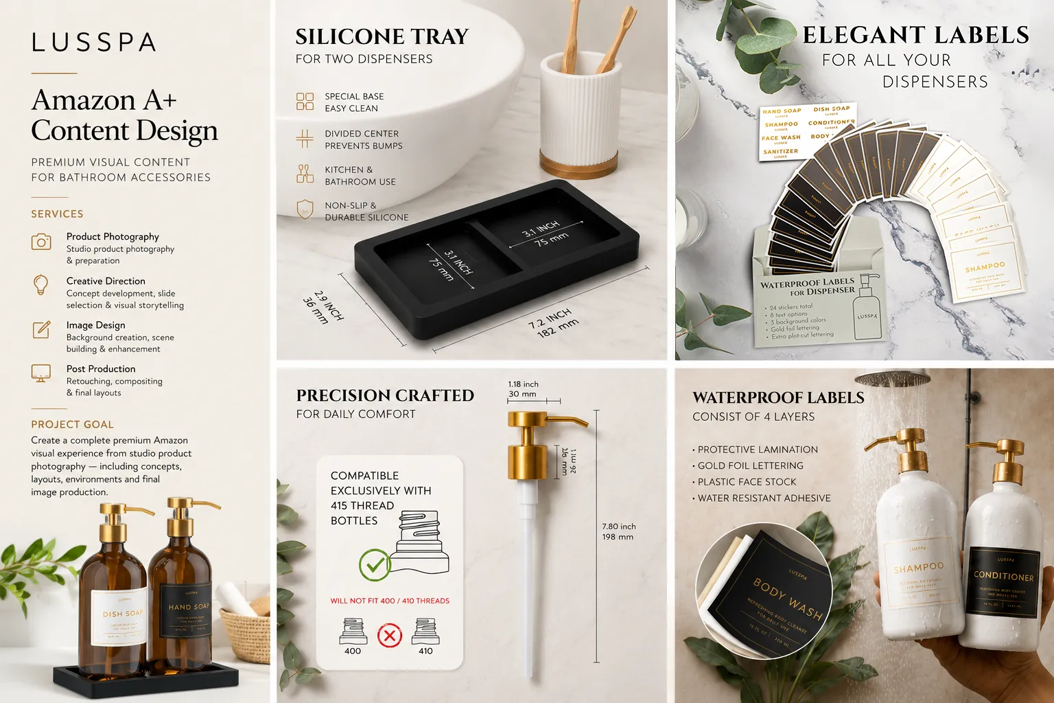
A full premium visual system for bathroom accessories — from studio shoots to editorial slides that convert.
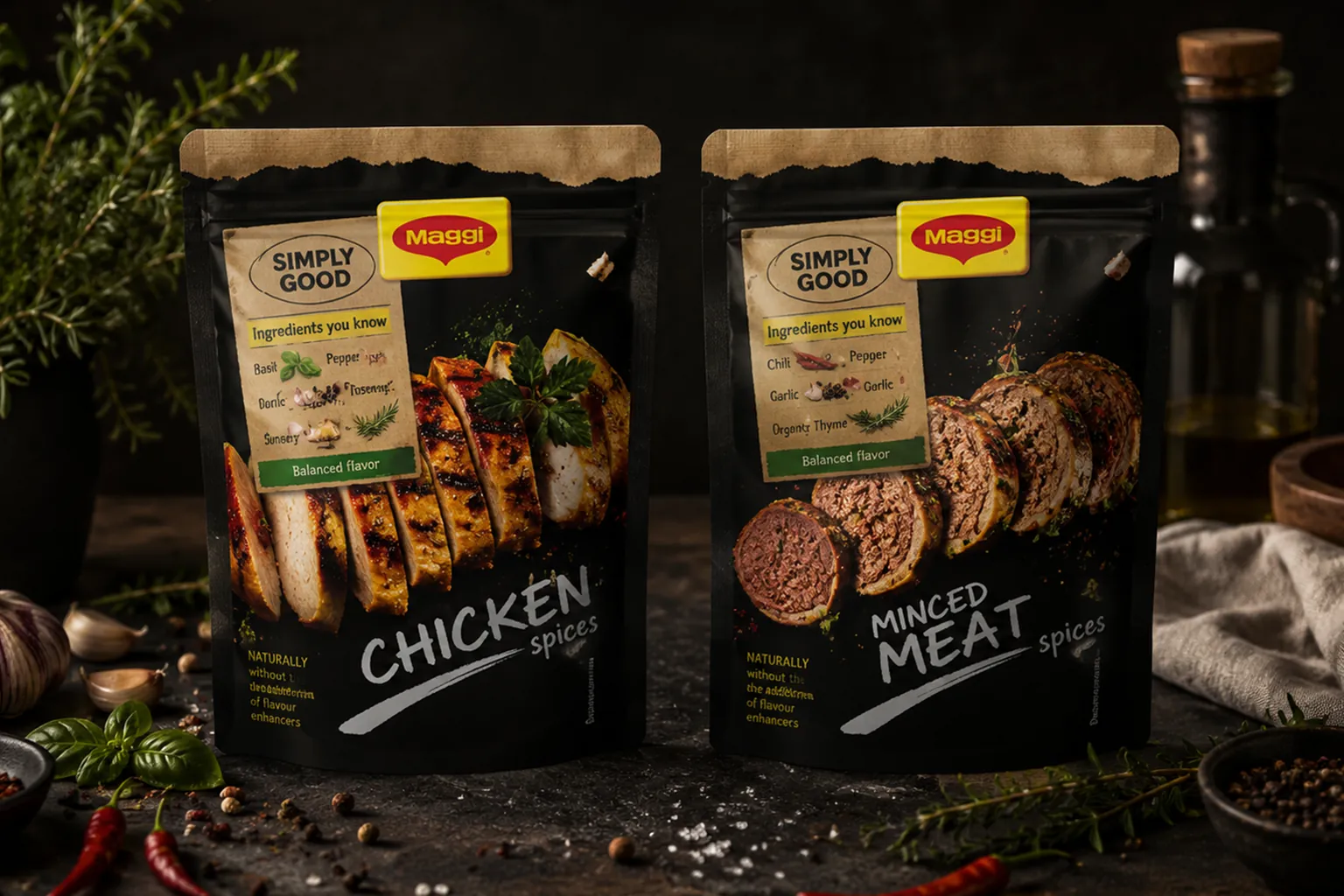
Concept packaging and food photography for the Simply Good range — a pitch project for Nestlé, awarded second place, and finished as if it were already going to print.
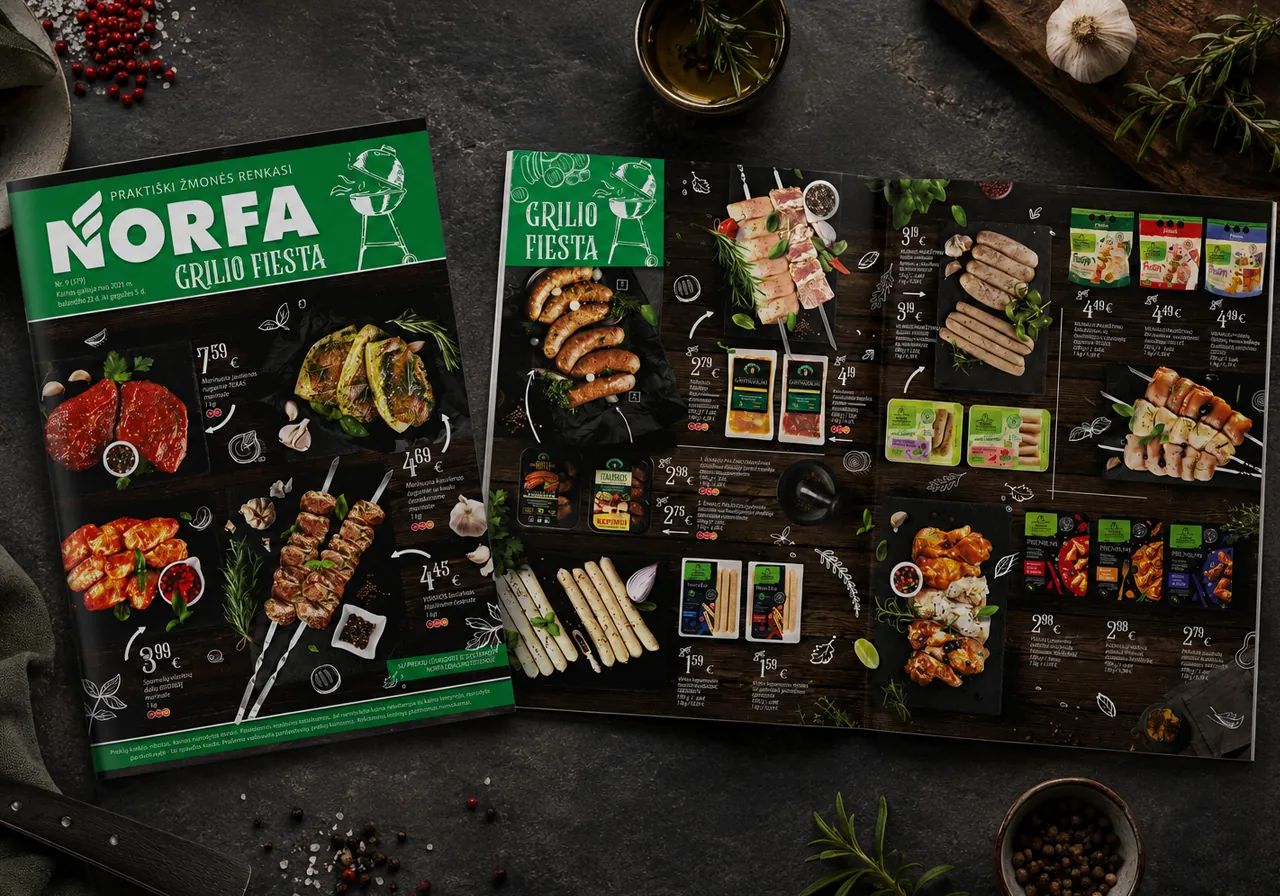
Eight pages, including a dedicated cover, turned into a publication of their own — dark slate, chalk illustrations and raw marinated cuts creating a bold visual break within Norfa’s weekly promotional publication.
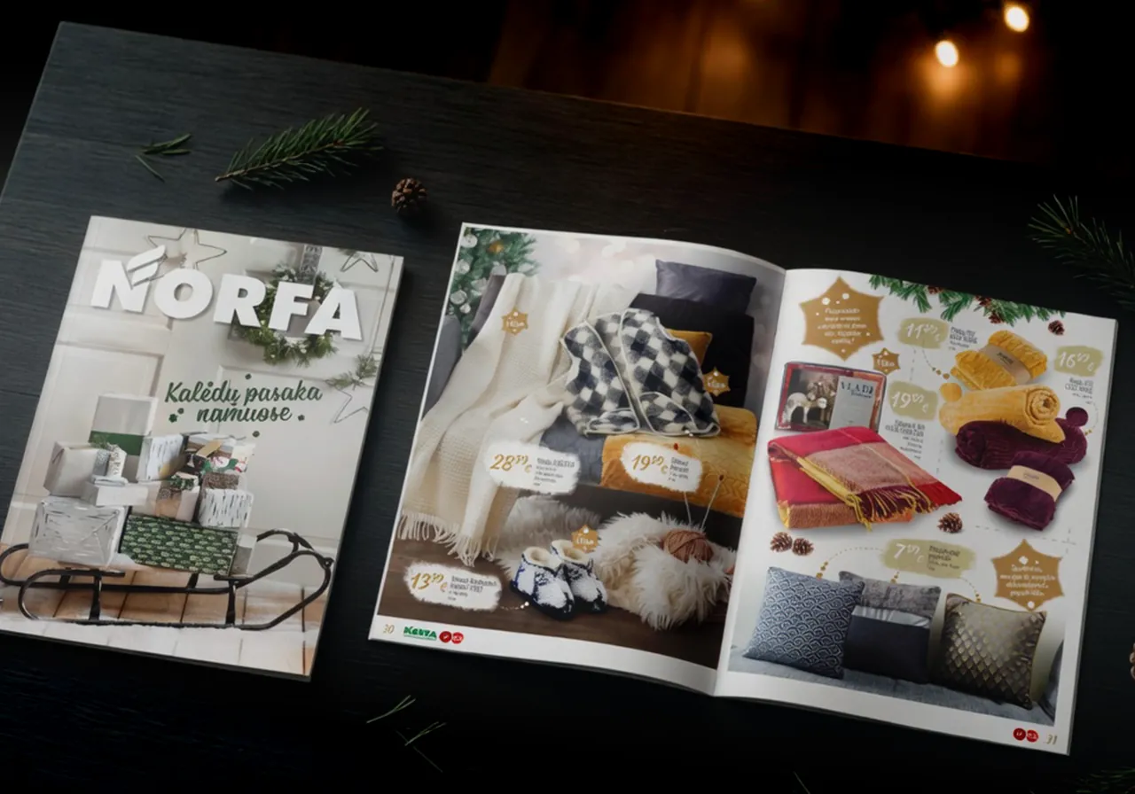
Every scene was built in front of the camera rather than assembled after it — the sled, the tree, the table, and every present wrapped by hand. One soft winter key held across the whole catalogue, from decorations to toys.
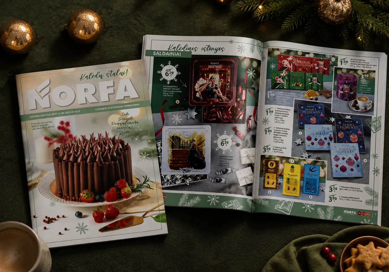
A whole holiday food range under one frame — meat, fish, cheese, prepared dishes and sweets, each lit to look like itself while the green-and-gold system holds the issue together. The cover went to a single cake, baked by a chef for Norfa and photographed in our studio.
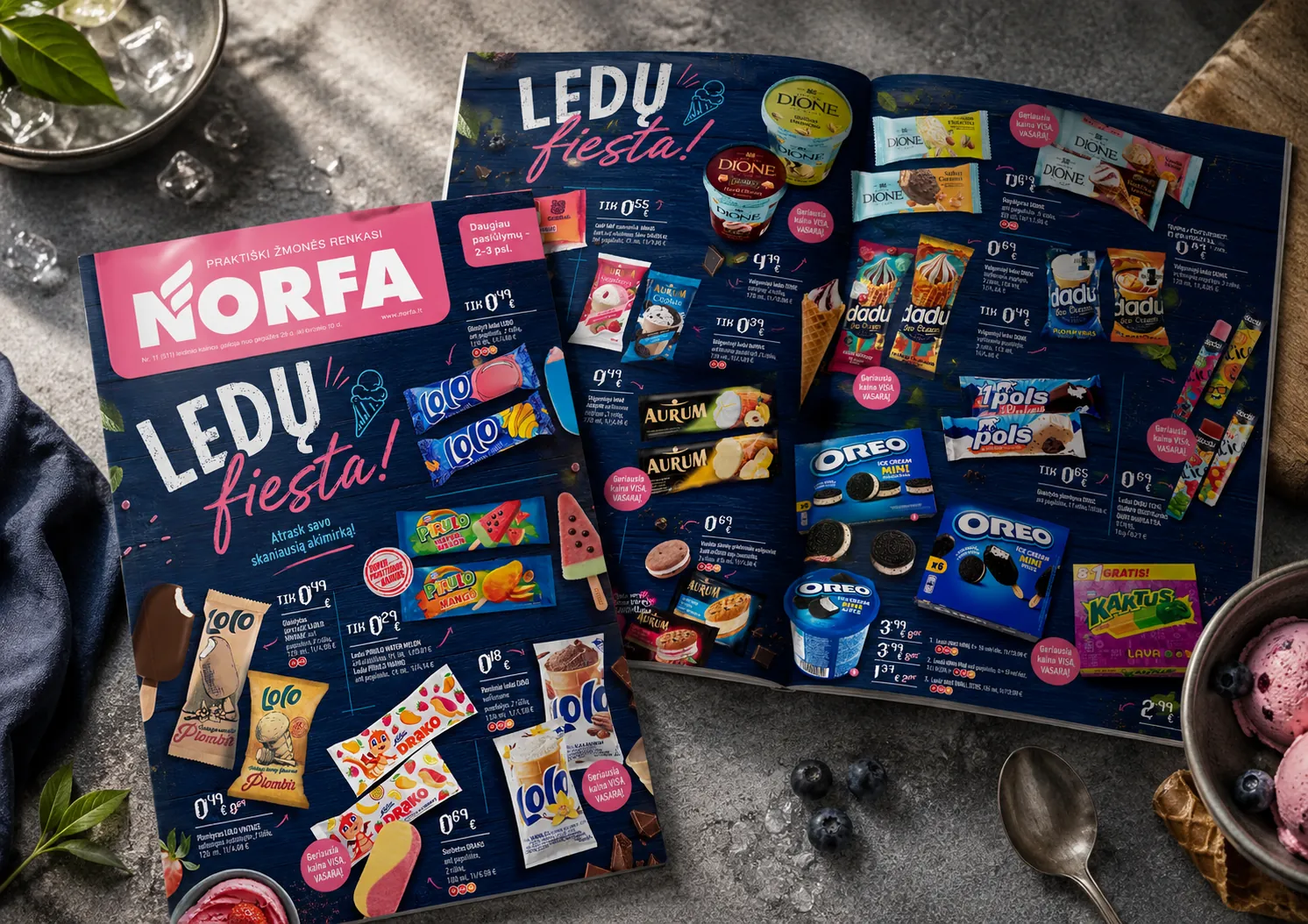
A dynamic concept built on rich texture, moody contrast and playful hand-lettering — every product shown in its wrapper and out of it, caught one melting second before it drips. Standard product pages turned into a celebration of warm-weather cravings.
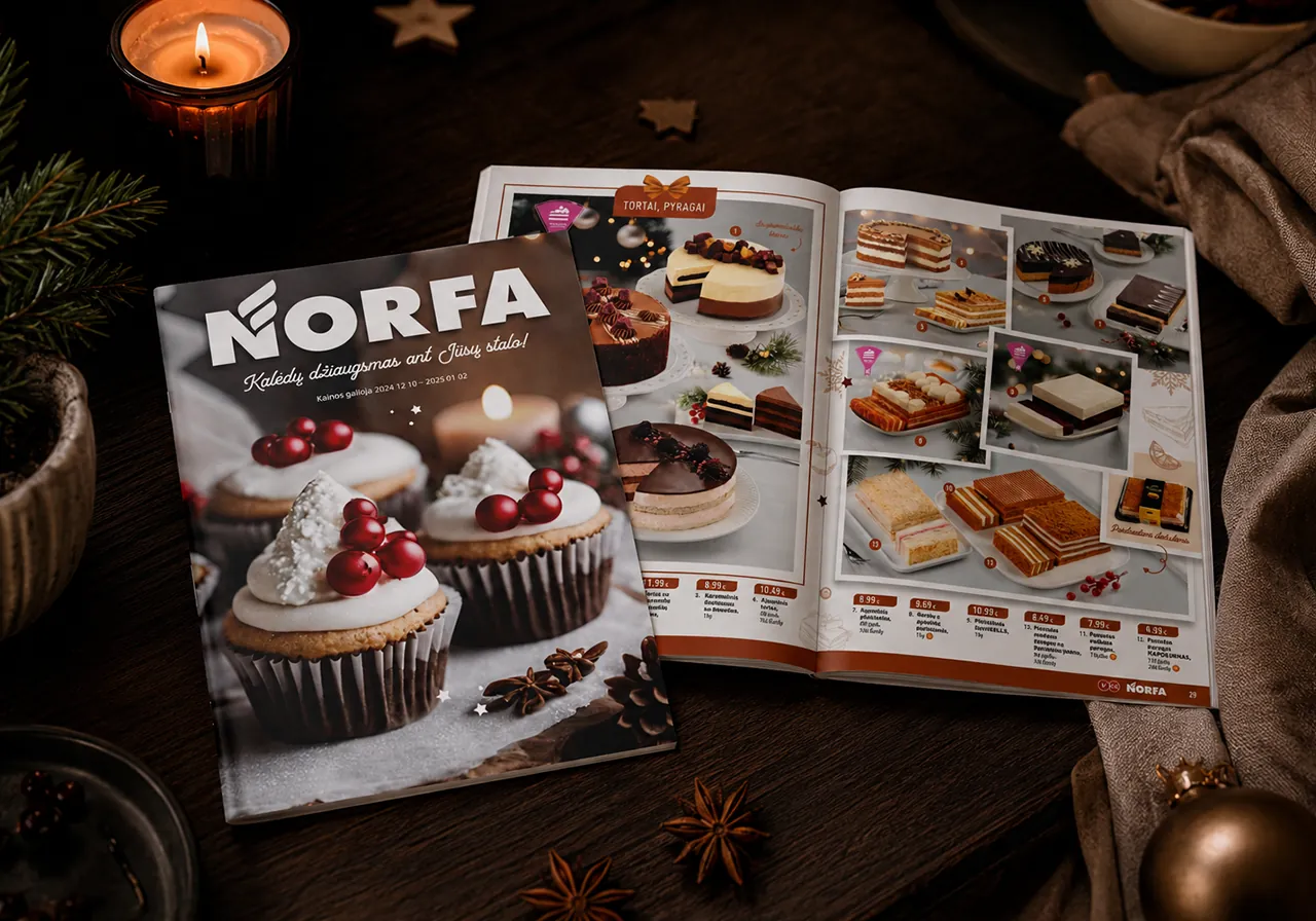
Every frame styled and lit by hand — one hero composition holding the left page, dozens of products shot one by one and woven into the grid on the right. Warm enough to linger over, precise enough to shop from.
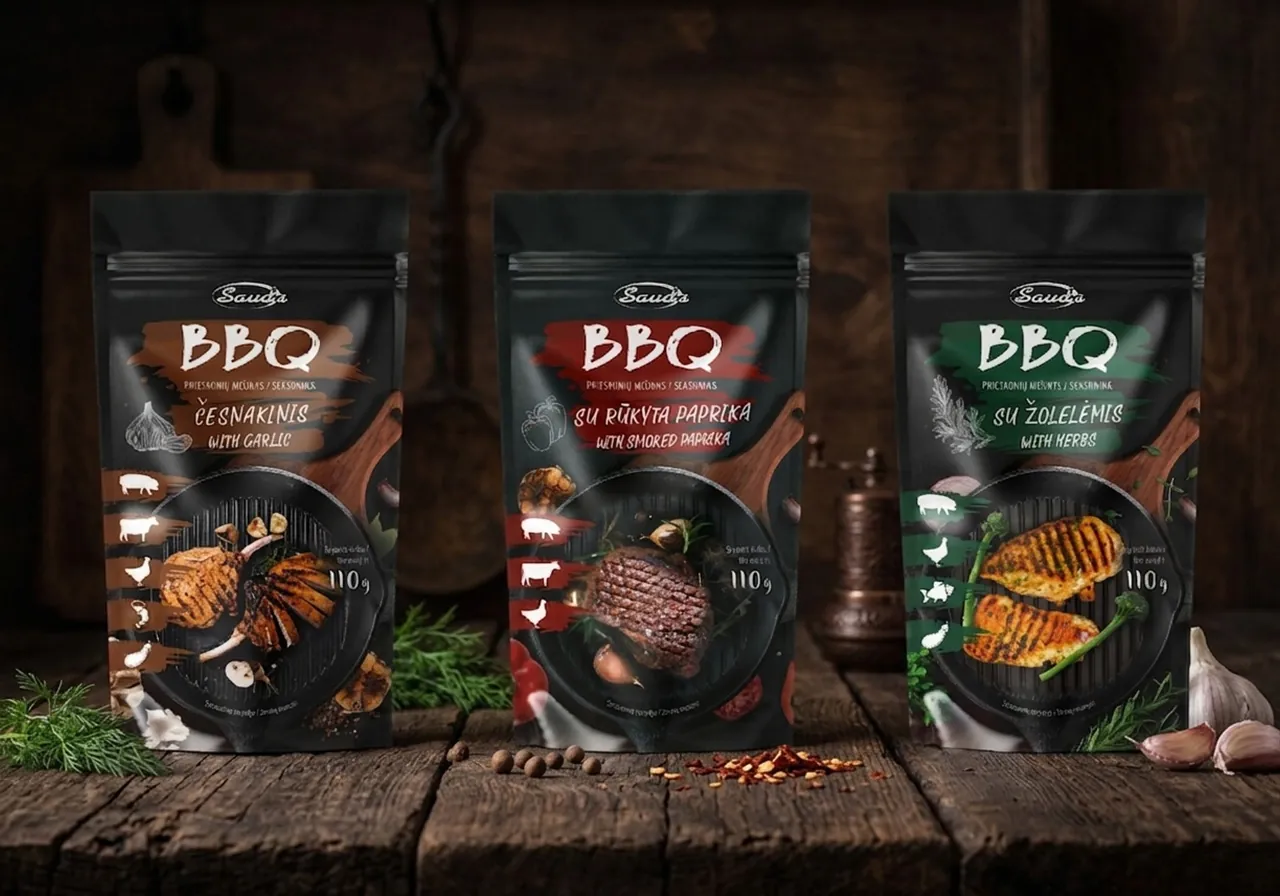
A premium look for an everyday shelf — matte black pouches, a single brushstroke of colour per flavour and grill imagery shown large, giving a supermarket spice mix the presence of a specialty product.
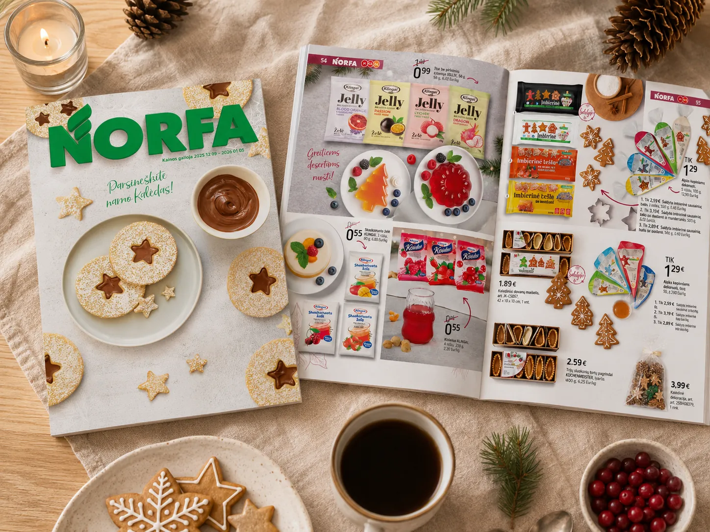
A holiday food issue that covers the whole table, opened by a cover our designer baked herself — the cookies made in our own kitchen before they were styled and shot.
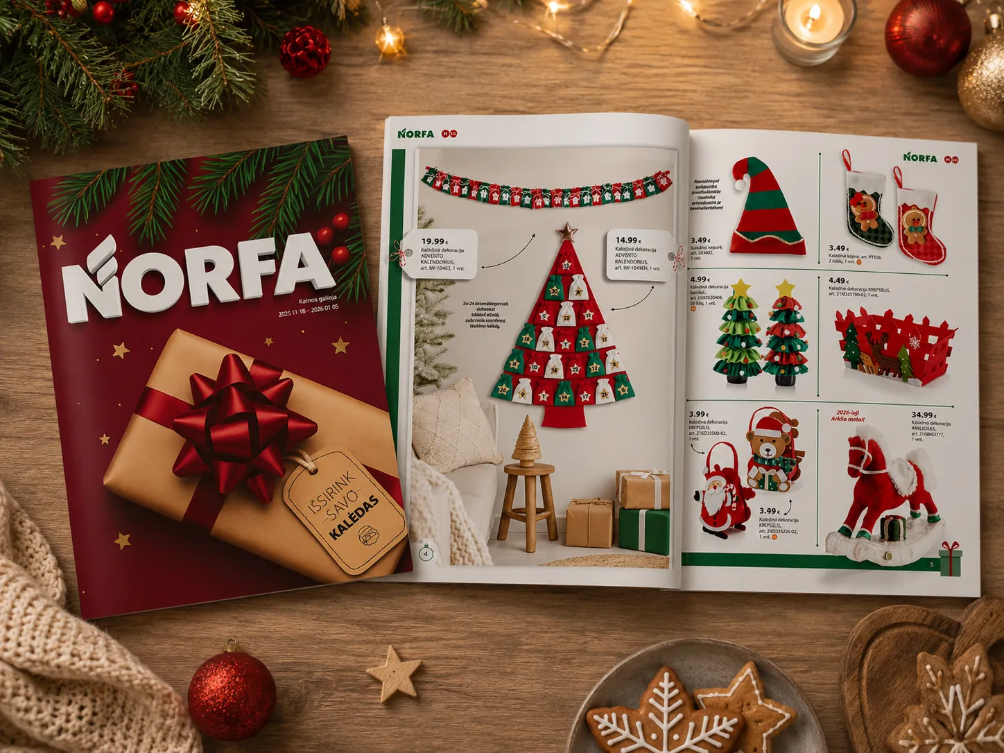
Each spread connects a styled mood scene on the left with a clean product grid on the right, grouping decorations, toys, and gifts to furnish a single room or tell a cohesive story.
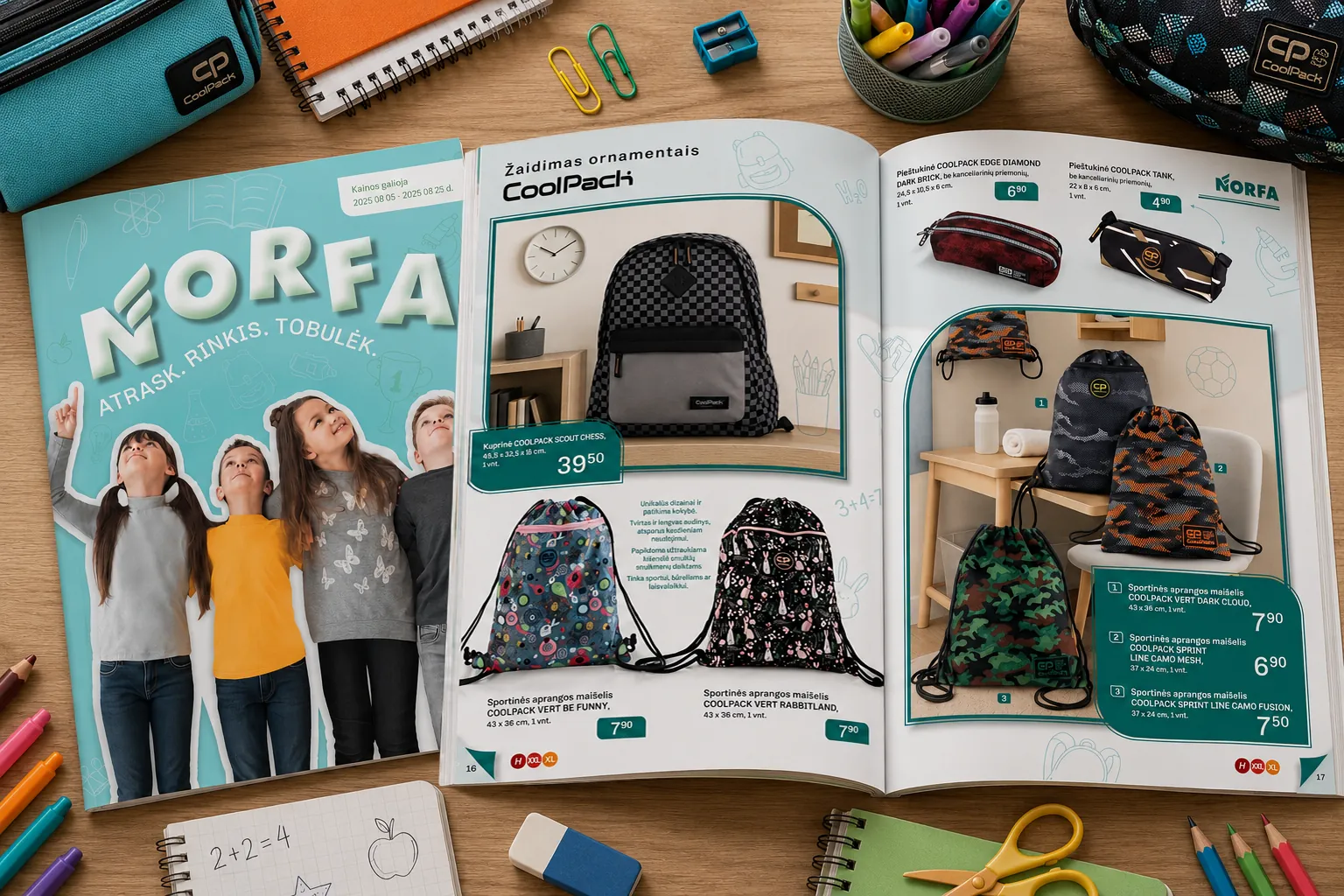
A back-to-school issue where every spread takes its accent colour from the products on it — hand-drawn doodles running underneath, room scenes where the things would actually be used, and clean cut-outs where the price has to lead.
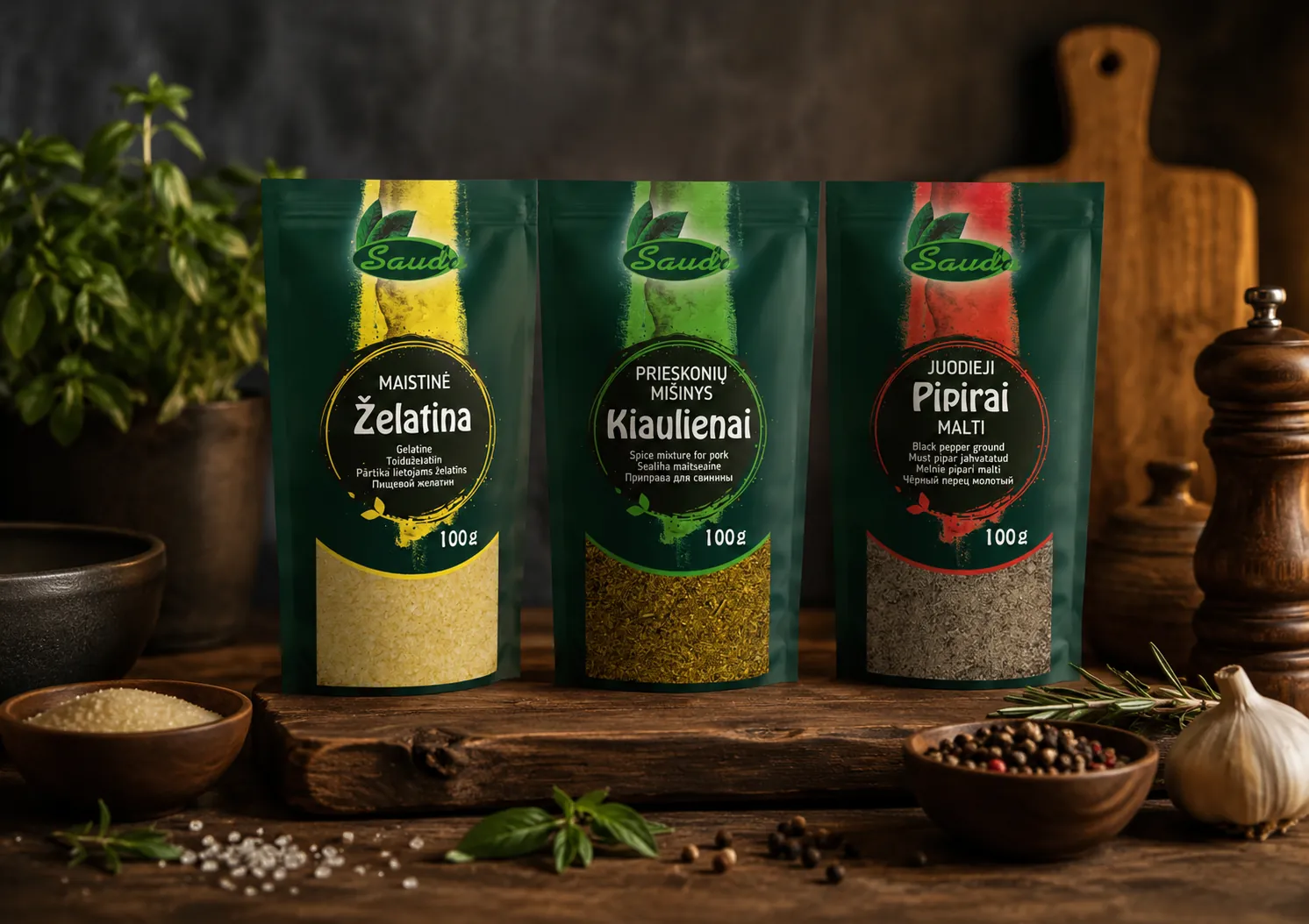
Sauda's core range — a dark green base, a brushed stroke of colour per product, and a window at the bottom letting the contents speak for themselves. Built to carry dozens of variants without a redesign.
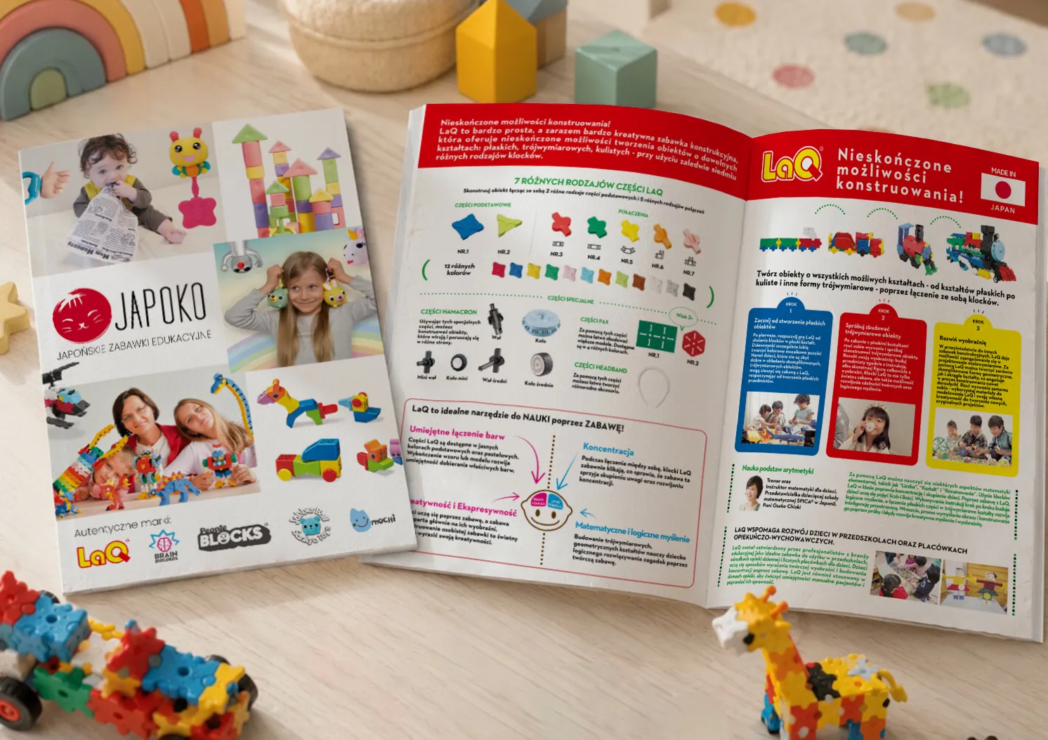
A presentation brochure introducing a family of Japanese educational toy brands to the adults who actually buy them — the construction system explained piece by piece and colour by colour, so a parent can scan it in a minute and a preschool can trust it.
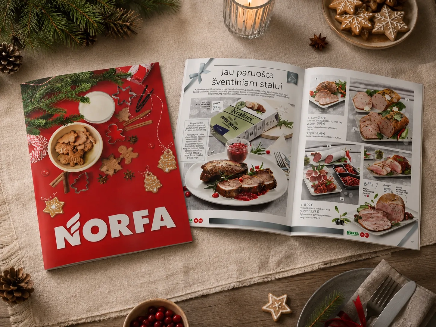
Built as a publication rather than a price list — every spread carried a few lines of its own story, and the cover was made rather than sourced: baked, glazed and tied by hand before it was shot.
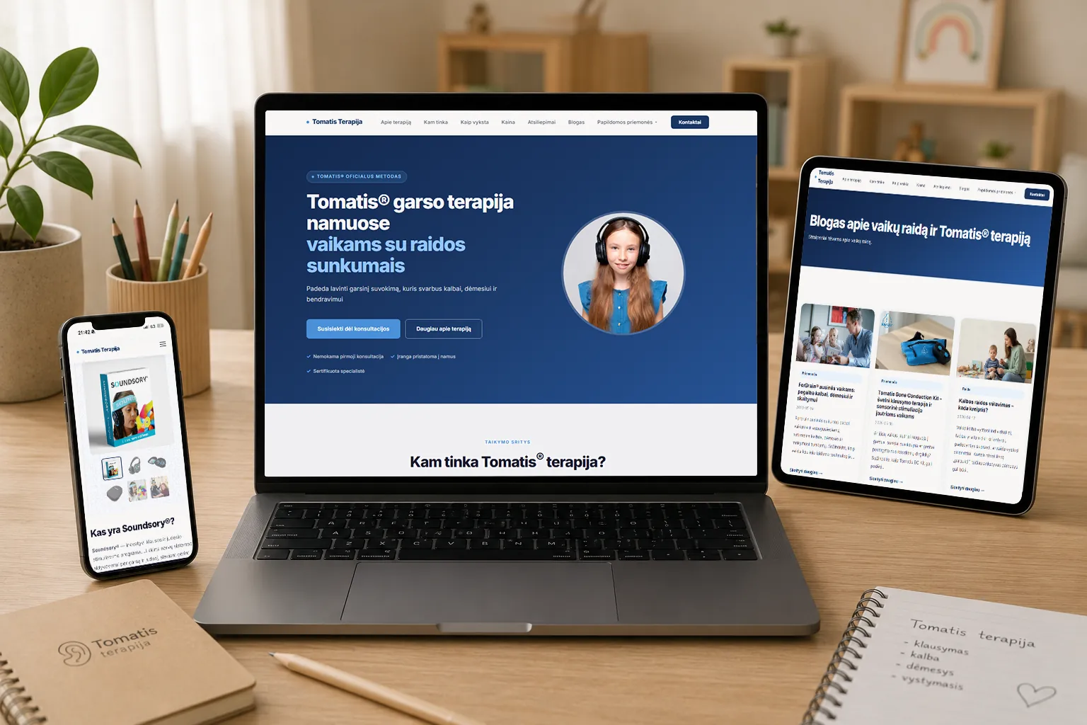
Design and SEO for a home-based Tomatis therapy practice — the method, the price and the four-step process explained in plain language, with the things that settle a worried parent placed above the pitch: a free first consultation, equipment delivered to the door, a certified specialist.
§ 02 · Capabilities
Retail catalogues, brochures and price-led publications — grids that carry dozens of products per spread without turning into noise.
Food and product photography shot in our own studio — sets built in front of the camera rather than assembled afterwards.
Packaging systems that stay legible on a shelf and hold up across dozens of variants, together with everything that goes to press beside them.
Naming, identity systems and the rules that keep them steady — built to survive the places we know best: a shelf, a spread, a print run.
§ 03 · The Studio
A team with a hands-on approach. No layers, no handoffs—from the first conversation to the final delivery, you’re working directly with the people making the work.
The work on this site is real: retail catalogues built from the ground up, food cooked and styled on set, photography shot in our own studio.
§ 04 · Got a bold idea?
Tell us about your brand, your product, or the problem you're trying to solve — we'll take it from there.
Start a project§ 05 · Get in touch
§ 05.1 · Start a conversation
Send a message
Message sent.
Thanks — we read everything that arrives, and usually reply within a working day.